
From one spot in NYC, and a radius of activity around it, Mark Edward Campos created a visualization of the sounds in the gyms, bars, clubs and parks that typify this small sampling of the city. While outdoor sounds are notably lacking, such as one might expect from parks, and the data sampling is narrow, it creates a lively pattern of aspects of life in the city.

How would you like your Graphic Design?
Truth.

Biomimicry Institute - Biomimicry: A Tool for Innovation
A brief explanation of how architecture, engineering and design seek to model forward-thinking developments based on the structures and functions of biology. This is biomimicry.
See related:
Hotel Viura, Spain—Avant Garde amidst 17thC Architecture


A modern, twisted, tilted architectural design for Hotel Viura, in Spain, creates plenty of window areas and terraces for guests to enjoy the old town views. Concrete cubes are starkly juxtaposed to the nearby 17th century church, yet the overall playfulness between old and new materials and forms, both indoors and outdoors, achieves a fresh and entertaining effect.

Spectacular Underwater Bedroom in Maldives
via mymodernmet.com
For those that take inspiration from marine life, aquatic dreaming made possible here, at the Conrad Maldives Rangali Island resort.
Burt & Bumble Packaging & Identity Design


Collection of Pencil Carvings
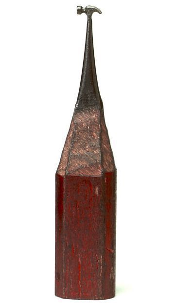


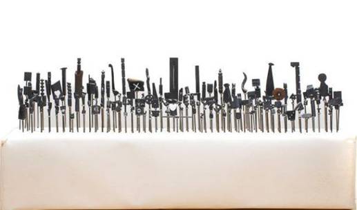


Consider these for creative inspiration: The tiny working surface, and the craftman's commitment to re-using something that usually is discarded after its obvious function has diminshed—something that can inspire designers in their work.

Minimalist, Green Packaging Design
This packaging design idea for Coke bottles approaches eco-friendliness on several counts. For material, student designer Andrew Kim proposes plant-based material, while the the bottle's straight-edged shape and curved bottom is tightly stackable, thereby reducing wasted space in shipping containers, and in turn, reducing carbon emissions for the product's distribution. Additionally, the proposed material is crushable down to 34% the packages' original size in a pre-scored accordion fold, to encourage habitual recycling. This is a great example of how a few, well-thought out design decisions could impact mass habits, and in turn, encourage desirable effects on the larger scale.

Designing "No Plot? No Problem!"
Based on the book, No Plot? No Problem!: A Low-Stress, High-Velocity Guide to Writing a Novel in 30 Days, this kit takes the tone and task of inspiring writers one step further. It includes a clam shell box, inspiration cards immersed in tongue-in-cheek tone, a Noveling Affidavit, a progress calendar, and other humorous elements to keep a writer on task, all designed in bold colors and a retro-styled typographic treatment that aptly underscores the humor in the kit, and emphasizes the brand tone in the original book. Designed by Rise-and-Shine Studio.
Peek into a Design's Layers
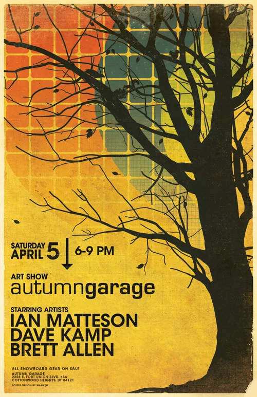
It can be challenging for designers to communicate to non-designers the amount of work that can go into a good design. This peek into an event poster design is a great opportunity to illustrate part of the design process.
Designer Shelby White, aka Wanken, has generously shared a screen shot, or more aptly, the many screen shots that it took to show the number of layers in the file: 90 layers. File size: 618MB.
Brilliant Receipt Design doubles as Infographic


via dezeen.com
Here's a shining example of employing designers' user-focused and creative problem-solving thinking to transform dull, tired customer touch-points into something of more value. Listing the caloric values of the shopper's purchases, information about the purchased products' demand, and even information on events in the area, the simple receipt thus converts the experience of shopping at the market into an activity that directly relates to the customer's daily routines. It even plays serendipitously with an opportunity in mini history lessons.
Credit: BERG

Dear Typography... An Ode.
No explanation required; it's all in there.
Design is a Way of Life
"Design is a way of life, a point of view. It involves the whole complex of visual communications: talent, creative ability, manual skill, and technical knowledge. Aesthetics and economics, technology and psychology are intrinsically related to the process."—Paul Rand, from A Designer's Words.

Those Willing to Get Dirty
via ffffound.com
The future belongs to the few of us still willing to get our hands dirty.
... with ink, paint, paper....
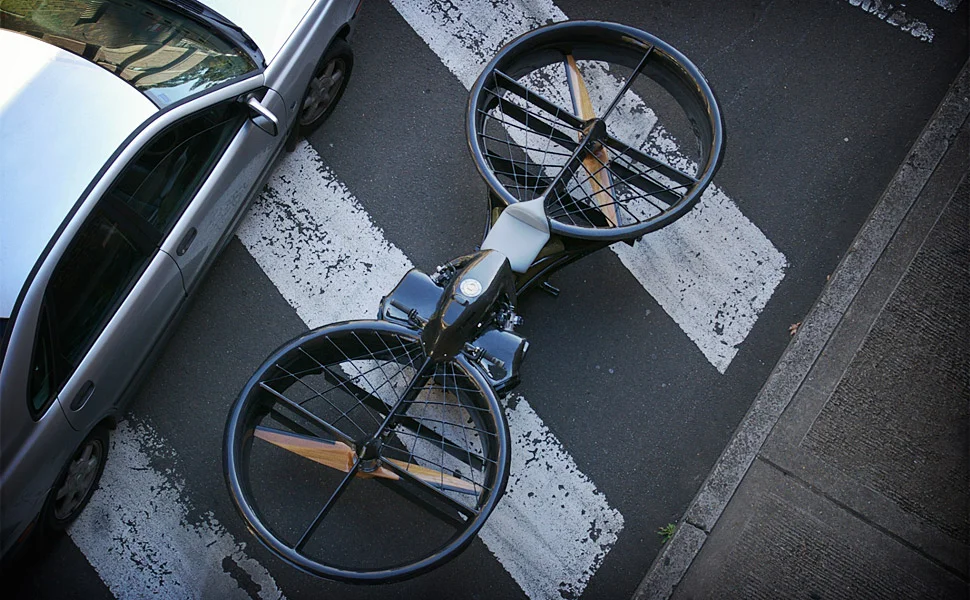
The Hoverbike
via uncrate.com
An ultralight, hoovering craft with an open seat like a motorcycle, the Hoverbike can go 100 miles per fuel fill and hover at 10,000 feet. That's one way to make the urban ground more pedestrian-friendly.
Neon Boneyard is a Typophile's Treasure Chest


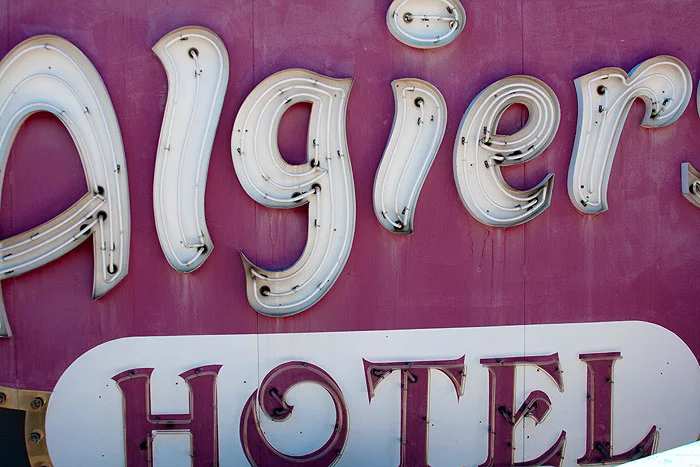

Discarded for their glory days past, the rusting signs at Las Vegas' Neon Boneyard, part of the Neon Museum, are chock-full of dazzling letter shapes for typophiles, and textures and color for other graphically-inclined eyes.

True Colors Infographic - Breakdown of Color Preferences by Gender
While this test is based on a narrow sampling of 232 people from 22 countries, the main findings are:
• The most preferred color, regardless of gender, is blue
• Orange is associated with inexpensiveness in both genders
• Men prefer brighter hues, but tolerate less saturated colors, and prefer shades over tints
• Women prefer softer hues, are less tolerant of unsaturated colors, and prefer tints over shades
• Purple is widely popular as a favorite among women, but widely unpopular among men