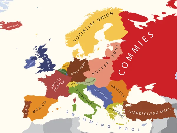
Image 1: Europe according to the U.S.
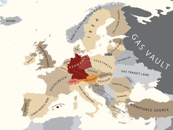
Image 2: Europe according to Germany
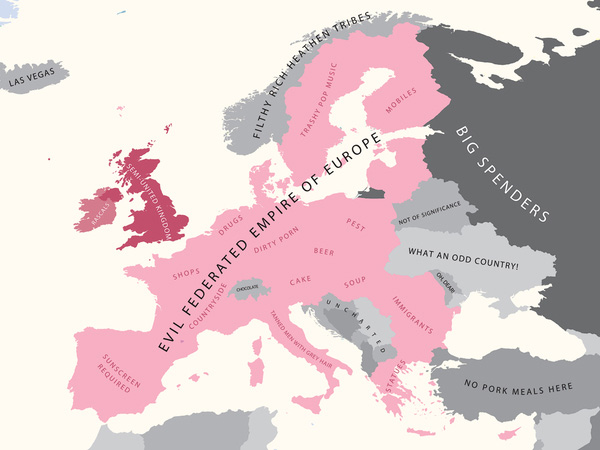
Image 3: Europe according to Britain
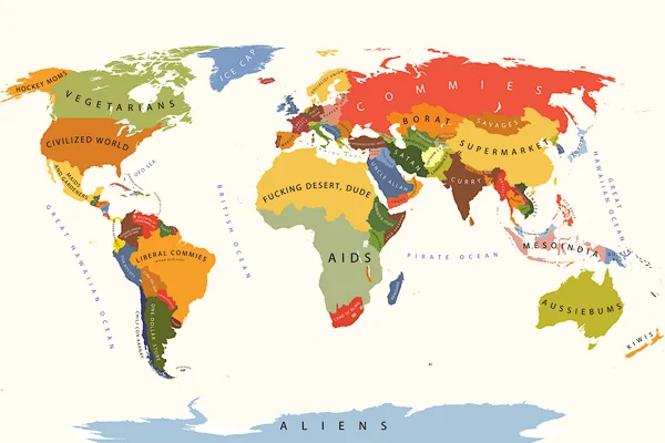
Image 4: The Word according to the U.S.
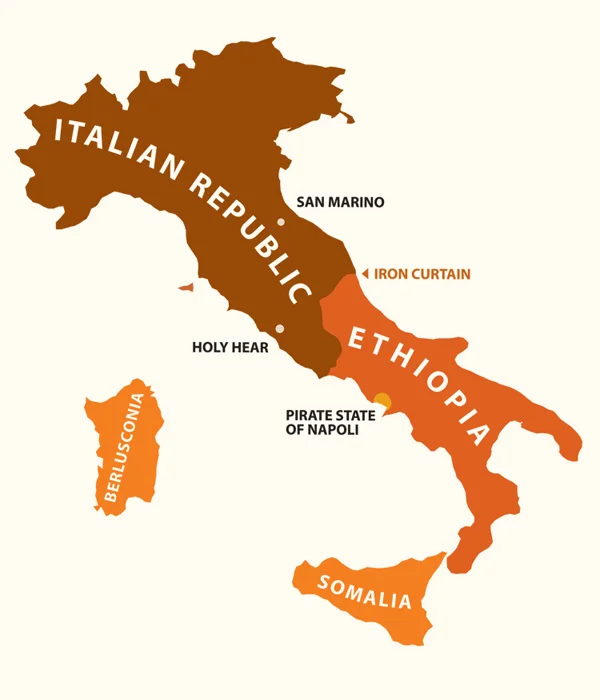
Image 5: Italy according to Italians
These colorful, appealing maps can easily be construed as either funny or offensive, or both—depending, naturally, on one's own geographic point of view. The World according to the USA, Europe according to Great Britain, Italy according to Italians, and many other maps show funny yet accurate stereotypical thinking of "the others." Wearable as T-shirts, they invite humorous provocation and an acknowledgement of the costs and foolishness of the ever-present contests and strifes between humans—or the like.
These are a great reminder that beautiful visuals can be created for any purpose, and that graphic design and other visual works are created in the context of cultural environment, political motivation, or economic purpose... be it a religion, a social movement, a hedonistic appeal, nationalistic pride, etc.—especially good reminders during election cycles or when evaluating infographics.
From Alphadesigner.
Thanks to SandroP for sharing this find.

