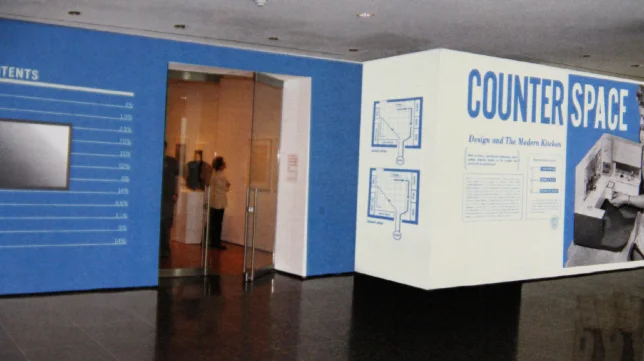
The subject of the exhibition at New York's Museum of Modern Art is Counter Space: Design and the Modern Kitchen. Brigitta Bungard, Design Manger of the museum's Graphic Design Department, and the exhibition design team share the journey of design explorations for the project.
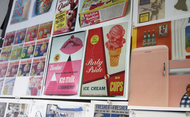
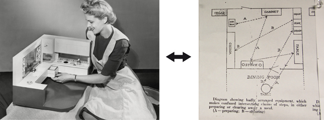
Starting with 1940's food and kitchen ads as reference, the team was cued to accentuate diagonal lines in the exhibit's entrance, as guided by the lines in a photo of a period housewife. The ads also gave the team the idea to create a pattern with type, then to use it as a wall treatment—later abandoned. A simpler direction led the team to play with bold blue lines, but eventually this was deemed too reminiscent of milk cartons. In the final treatment, a light blue was chosen to deliniate diagonal lines pointing to the exhibit's entrance, with a corner element anchoring type blocks on written displays.


